
Data visualization is the discipline of trying to understand data by placing it in a visual context so that patterns, trends, and correlations that might not otherwise be detected can be exposed.
Python offers multiple great graphing libraries packed with lots of different features. Whether you want to create interactive or highly customized plots, Python has an excellent library for you.
To get a little overview, here are a few popular plotting libraries:
- Matplotlib: low level, provides lots of freedom
- Pandas Visualization: easy to use interface, built on Matplotlib
- Seaborn: high-level interface, great default styles
- plotnine: based on R’s ggplot2, uses Grammar of Graphics
- Plotly: can create interactive plots
In this article, we will learn how to create basic plots using Matplotlib, Pandas visualization, and Seaborn as well as how to use some specific features of each library. This article will focus on the syntax and not on interpreting the graphs, which I will cover in another blog post.
In further articles, I will go over interactive plotting tools like Plotly, which is built on D3 and can also be used with JavaScript.
Importing Datasets
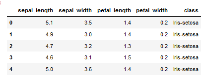
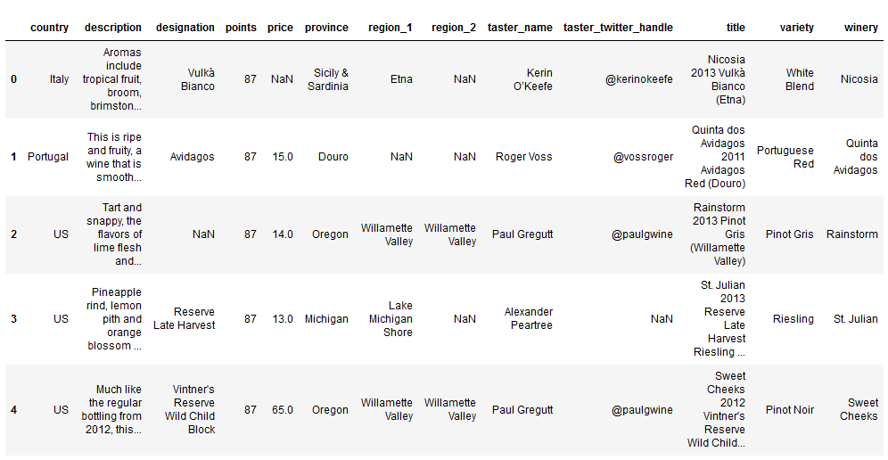
In this article, we will use two freely available datasets. The Iris and Wine Reviews dataset, which we can both load into memory using pandas read_csv method.
import pandas as pd
iris = pd.read_csv('iris.csv', names=['sepal_length', 'sepal_width', 'petal_length', 'petal_width', 'class'])
print(iris.head())
wine_reviews = pd.read_csv('winemag-data-130k-v2.csv', index_col=0)
wine_reviews.head()
Matplotlib
Matplotlib is the most popular Python plotting library. It is a low-level library with a Matlab-like interface that offers lots of freedom at the cost of having to write more code.
To install Matplotlib, pip, and conda can be used.
pip install matplotlib
or
conda install matplotlib
Matplotlib is specifically suitable for creating basic graphs like line charts, bar charts, histograms, etc. It can be imported by typing:
import matplotlib.pyplot as plt
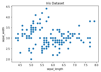
Scatter Plot
To create a scatter plot in Matplotlib, we can use the scatter method. We will also create a figure and an axis using plt.subplots to give our plot a title and labels.
# create a figure and axis
fig, ax = plt.subplots()

# scatter the sepal_length against the sepal_width
ax.scatter(iris['sepal_length'], iris['sepal_width'])
# set a title and labels
ax.set_title('Iris Dataset')
ax.set_xlabel('sepal_length')
ax.set_ylabel('sepal_width')
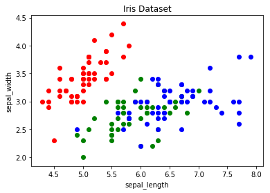
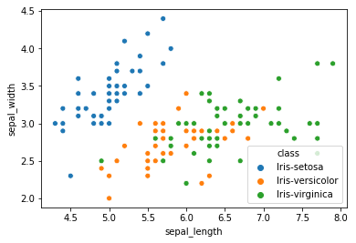
We can give the graph more meaning by coloring each data point by its class. This can be done by creating a dictionary that maps from class to color and then scattering each point on its own using a for-loop and passing the respective color.
# create color dictionary
colors = {'Iris-setosa':'r', 'Iris-versicolor':'g', 'Iris-virginica':'b'}
# create a figure and axis
fig, ax = plt.subplots()
# plot each data-point
for i in range(len(iris['sepal_length'])):
    ax.scatter(iris['sepal_length'][i], iris['sepal_width'][i],color=colors[iris['class'][i]])
# set a title and labels
ax.set_title('Iris Dataset')
ax.set_xlabel('sepal_length')
ax.set_ylabel('sepal_width')
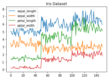
Line Chart
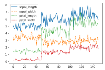
In Matplotlib, we can create a line chart by calling the plot method. We can also plot multiple columns in one graph by looping through the columns we want and plotting each column on the same axis.
# get columns to plot
columns = iris.columns.drop(['class'])
# create x data
x_data = range(0, iris.shape[0])
# create figure and axis
fig, ax = plt.subplots()
# plot each column
for column in columns:
    ax.plot(x_data, iris[column])
# set title and legend
ax.set_title('Iris Dataset')
ax.legend()
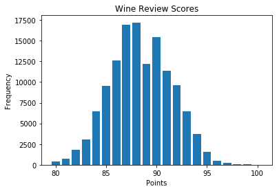
Histogram
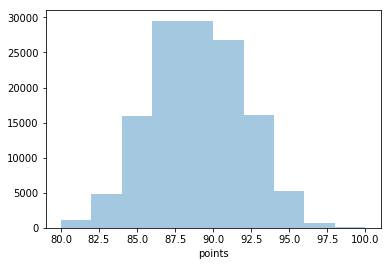
In Matplotlib, we can create a Histogram using the hist method. If we pass categorical data like the points column from the wine-review dataset, it will automatically calculate how often each class occurs.
# create figure and axis
fig, ax = plt.subplots()
# plot histogram
ax.hist(wine_reviews['points'])
# set title and labels
ax.set_title('Wine Review Scores')
ax.set_xlabel('Points')
ax.set_ylabel('Frequency')

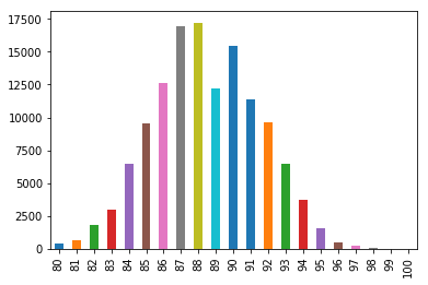
Bar Chart
A bar chart can be created using the bar method. The bar chart isn’t automatically calculating the frequency of a category, so we will use pandas value_counts method to do this. The bar chart is useful for categorical data that doesn’t have a lot of different categories (less than 30) because else it can get quite messy.
# create a figure and axis
fig, ax = plt.subplots()
# count the occurrence of each class
data = wine_reviews['points'].value_counts()
# get x and y data
points = data.index
frequency = data.values
# create bar chart
ax.bar(points, frequency)
# set title and labels
ax.set_title('Wine Review Scores')
ax.set_xlabel('Points')
ax.set_ylabel('Frequency')
Pandas Visualization
Pandas is an open-source, high-performance, and easy-to-use library providing data structures, such as data frames and data analysis tools like the visualization tools we will use in this article.
Pandas Visualization makes it easy to create plots out of a pandas dataframe and series. It also has a higher-level API than Matplotlib, and therefore we need less code for the same results.
Pandas can be installed using either pip or conda.
pip install pandas
or
conda install pandas
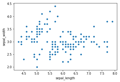
Scatter Plot
To create a scatter plot in Pandas, we can call <dataset>.plot.scatter() and pass it two arguments, the name of the x-column and the name of the y-column. Optionally we can also give it a title.
iris.plot.scatter(x='sepal_length', y='sepal_width', title='Iris Dataset')

As you can see in the image, it is automatically setting the x and y label to the column names.
Line Chart
To create a line chart in Pandas we can call <dataframe>.plot.line(). While in Matplotlib, we needed to loop through each column we wanted to plot, in Pandas we don’t need to do this because it automatically plots all available numeric columns (at least if we don’t specify a specific column/s).
iris.drop(['class'], axis=1).plot.line(title='Iris Dataset')

If we have more than one feature, Pandas automatically creates a legend for us, as seen in the image above.
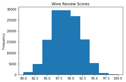
Histogram
In Pandas, we can create a Histogram with the plot.hist method. There aren’t any required arguments, but we can optionally pass some like the bin size.
wine_reviews['points'].plot.hist()
It’s also straightforward to create multiple histograms.
iris.plot.hist(subplots=True, layout=(2,2), figsize=(10, 10), bins=20)
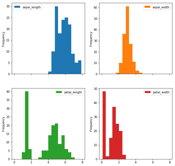
The subplots argument specifies that we want a separate plot for each feature, and the layout specifies the number of plots per row and column.
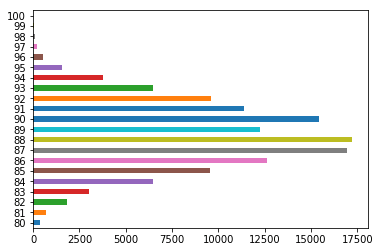
Bar Chart
To plot a bar chart, we can use the plot.bar() method, but before calling this, we need to get our data. We will first count the occurrences using the value_count() method and then sort the occurrences from smallest to largest using the sort_index() method.
wine_reviews['points'].value_counts().sort_index().plot.bar()
It’s also really simple to make a horizontal bar chart using the plot.barh() method.
wine_reviews['points'].value_counts().sort_index().plot.barh()
We can also plot other data than the number of occurrences.
wine_reviews.groupby("country").price.mean().sort_values(ascending=False)[:5].plot.bar()
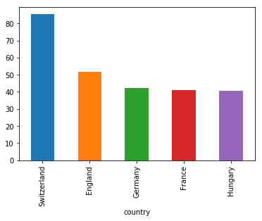
In the example above, we grouped the data by country, took the mean of the wine prices, ordered it, and plotted the five countries with the highest average wine price.
Seaborn
Seaborn is a Python data visualization library based on Matplotlib. It provides a high-level interface for creating attractive graphs.
Seaborn has a lot to offer. For example, you can create graphs in one line that would take multiple tens of lines in Matplotlib. Its standard designs are awesome, and it also has a nice interface for working with Pandas dataframes.
It can be imported by typing:
import seaborn as sns
Scatter plot
We can use the .scatterplot method for creating a scatterplot, and just as in Pandas, we need to pass it the column names of the x and y data, but now we also need to pass the data as an additional argument because we aren’t calling the function on the data directly as we did in Pandas.
sns.scatterplot(x='sepal_length', y='sepal_width', data=iris)
We can also highlight the points by class using the hue argument, which is a lot easier than in Matplotlib.
sns.scatterplot(x='sepal_length', y='sepal_width', hue='class', data=iris)
Line chart
To create a line chart, the sns.lineplot method can be used. The only required argument is the data, which in our case are the four numeric columns from the Iris dataset. We could also use the sns.kdeplot method, which smoothes the edges of the curves and therefore is cleaner if you have a lot of outliers in your dataset.
sns.lineplot(data=iris.drop(['class'], axis=1))
Histogram
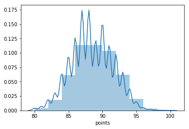
To create a histogram in Seaborn, we use the sns.distplot method. We need to pass it the column we want to plot, and it will calculate the occurrences itself. We can also pass it the number of bins and if we want to plot a gaussian kernel density estimate inside the graph.
sns.distplot(wine_reviews['points'], bins=10, kde=False)
sns.distplot(wine_reviews['points'], bins=10, kde=True)
Bar chart
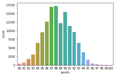
In Seaborn, a bar chart can be created using the sns.countplot method and passing it the data.
sns.countplot(wine_reviews['points'])
Other graphs
Now that you have a basic understanding of the Matplotlib, Pandas Visualization, and Seaborn syntax, I want to show you a few other graph types that are useful for extracting insides.
For most of them, Seaborn is the go-to library because of its high-level interface that allows for the creation of beautiful graphs in just a few lines of code.
Box plots
A Box Plot is a graphical method of displaying the five-number summary. We can create box plots using seaborn's sns.boxplot method and passing it the data as well as the x and y column names.
df = wine_reviews[(wine_reviews['points']>=95) & (wine_reviews['price']<1000)]
sns.boxplot('points', 'price', data=df)
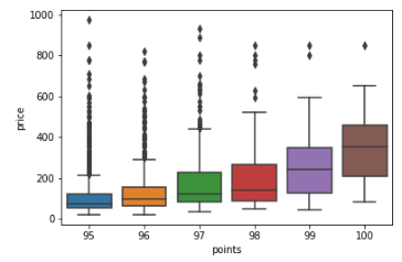
Box Plots, just like bar charts, are great for data with only a few categories but can get messy quickly.
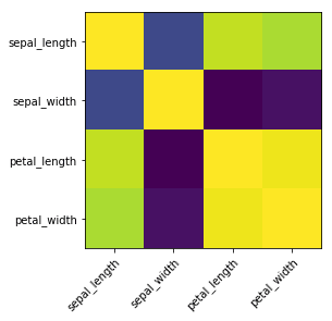
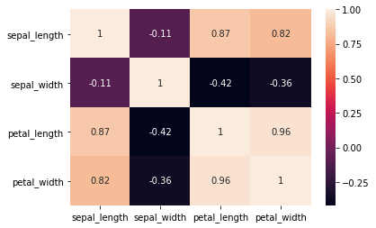
Heatmap
A Heatmap is a graphical representation of data where the individual values contained in a matrix are represented as colors. Heatmaps are perfect for exploring the correlation of features in a dataset.
To get the correlation of the features inside a dataset, we can call <dataset>.corr(), which is a Pandas dataframe method. This will give us the correlation matrix.
We can now use either Matplotlib or Seaborn to create the heatmap.
Matplotlib:
# get correlation matrix
corr = iris.corr()
fig, ax = plt.subplots()
# create heatmap
im = ax.imshow(corr.values)

# set labels
ax.set_xticks(np.arange(len(corr.columns)))
ax.set_yticks(np.arange(len(corr.columns)))
ax.set_xticklabels(corr.columns)
ax.set_yticklabels(corr.columns)

# Rotate the tick labels and set their alignment.
plt.setp(ax.get_xticklabels(), rotation=45, ha="right",
rotation_mode="anchor")
To add annotations to the heatmap, we need to add two for loops:
# get correlation matrix
corr = iris.corr()
fig, ax = plt.subplots()
# create heatmap
im = ax.imshow(corr.values)

# set labels
ax.set_xticks(np.arange(len(corr.columns)))
ax.set_yticks(np.arange(len(corr.columns)))
ax.set_xticklabels(corr.columns)
ax.set_yticklabels(corr.columns)

# Rotate the tick labels and set their alignment.
plt.setp(ax.get_xticklabels(), rotation=45, ha="right",
         rotation_mode="anchor")

# Loop over data dimensions and create text annotations.
for i in range(len(corr.columns)):
    for j in range(len(corr.columns)):
        text = ax.text(j, i, np.around(corr.iloc[i, j], decimals=2),
ha="center", va="center", color="black")

Seaborn makes it way easier to create a heatmap and add annotations:
sns.heatmap(iris.corr(), annot=True)
Faceting
Faceting is the act of breaking data variables up across multiple subplots and combining those subplots into a single figure.
Faceting is helpful if you want to explore your dataset quickly.
To use one kind of faceting in Seaborn, we can use the FacetGrid. First of all, we need to define the FacetGrid and pass it our data as well as a row or column, which will be used to split the data. Then we need to call the map function on our FacetGrid object and define the plot type we want to use and the column we want to graph.
g = sns.FacetGrid(iris, col='class')
g = g.map(sns.kdeplot, 'sepal_length')
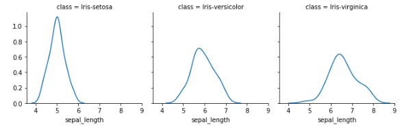
You can make plots bigger and more complicated than the example above. You can find a few examples here.
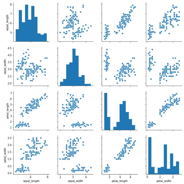
Pairplot
Lastly, I will show you Seaborns pairplot and Pandas scatter_matrix, which enable you to plot a grid of pairwise relationships in a dataset.
sns.pairplot(iris)
from pandas.plotting import scatter_matrix

fig, ax = plt.subplots(figsize=(12,12))
scatter_matrix(iris, alpha=1, ax=ax)
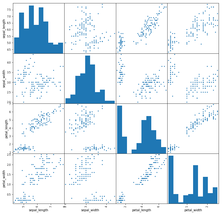
As you can see in the images above, these techniques are always plotting two features with each other. The diagonal of the graph is filled with histograms, and the other plots are scatter plots.
Conclusion
Data visualization is the discipline of trying to understand data by placing it in a visual context so that patterns, trends, and correlations that might not otherwise be detected can be exposed.
Python offers multiple great graphing libraries packed with lots of different features. In this article, we looked at Matplotlib, Pandas visualization, and Seaborn.